
iBidLogistics Simplified Way to Procure Login
Analytics & reporting

Every load leaves a trail. We turn it into a number you can act on.

iBidLogistics measures the freight it procures. Because the platform runs the plan, the auction, the trip and the invoice, the analytics are built from first-party records rather than a spreadsheet someone maintains after the fact — what you were quoted, what you paid, who bid, who won, who arrived on time.

Live dashboard

One dashboard for the whole procurement cycle

Filtered by branch and date range, so a plant manager and a group head are reading the same definitions on different slices.

Procurement overview

All branches · last 90 days
₹1.42 CrFreight spend ▼ 6.1% vs prior period
₹11.6 LAuction savings ▲ 8.4%
428Trips completed ▲ 3.2%
91.4%On-time delivery ▲ 2.7 pts
4.6Bids per freight ▲ 0.4

Plan to delivery

Plans created 512
Freights raised 451
Allotted to a transporter 364
In transit or delivered 328
Closed with POD 312

Each step is a real state change in the system, so the drop between any two is a queue you can go and clear — not an estimate.

Cost per tonne-km

3.2 3.0 2.8 2.6 Jan Mar May Jul Sep

Normalised by distance and weight, so a change in route mix doesn't read as a change in rate.

The figures on this page are illustrative. They show the shape of each view and how it is calculated — not any customer's results.

In your account

What it looks like in your account

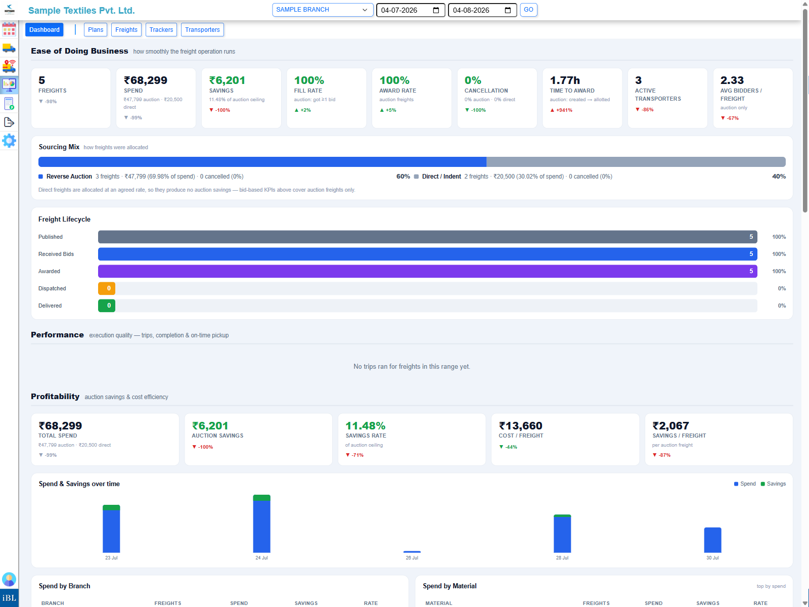
The mock-up above shows the shape of it; this is the live Ease of Doing Business view for an active account — real spend, real sourcing mix, real freight lifecycle, computed the same way.

The iBidLogistics Ease of Doing Business dashboard: freight spend, savings, fill rate, sourcing mix and freight lifecycle for a real account.
What's measured

Five views, each answering a different question

They sit on the tab you're already working in, so the numbers are next to the thing they describe.

Procurement — what is this costing us?

Spend and savings over any date range, split by branch and by material, with the same period a year or a quarter earlier alongside it. Savings are measured against the price you expected to pay when the freight was raised, so the number means something specific rather than being a headline.

Auctions — is the bidding actually competitive?

Bids per freight, how far the price moved between the opening and the winning bid, and how often a lane attracts only one bidder. A lane that never draws a second bid is not a market, and this is where you find it.

Planning — are we converting plans into trucks?

Plan-to-freight conversion, what is sitting in backlog, and schedule fidelity — whether loads actually moved on the date they were planned for. Demand against coverage shows where you are planning volume you have no carrier for.

Execution — did it arrive when we said?

On-time delivery against the promised date, turnaround at each stop, and where in the lifecycle trips are stalling — reported at gate, loading, in transit, waiting on proof of delivery.

Transporters — who is actually earning the work?

A scorecard per carrier covering how often they are invited, how often they bid, how often they win, and how they perform once they have the load. Drill into any one of them for the freight-by-freight ledger behind the score.

Registers — the underlying rows

Four registers behind the charts — plans, freights, trips and invoices — each exportable to Excel or PDF from the same definition that drew the chart, so finance and operations are never reconciling two different numbers.

Transporters

The transporter scorecard

Ranking carriers on price alone rewards whoever bids lowest and never turns up. This puts participation, price and performance in one row.

Participation

invited → bid → won
Carrier A 82%
Carrier B 64%
Carrier C 47%
Carrier D 23%
Carrier E 9%

Response rate — how often an invited carrier actually bids. A carrier at 9% is taking up an invitation slot without competing for it.

Price and performance

last 90 days
CarrierWonOn timeNear miss
Carrier A9694%₹340
Carrier B7191%₹610
Carrier C5278%₹1,180
Carrier D1889%₹2,050

Near miss is the gap between a carrier's final bid and the winning one. A carrier losing by a few hundred rupees every time is a rate conversation waiting to happen; one losing by thousands is not really competing on that lane.

Methodology

Why the numbers hold up

Analytics are only worth acting on if you can explain where each figure came from.

First-party records

Every figure traces to a row the platform wrote as the work happened — a bid, an allotment, a gate-in, a POD. Nothing is keyed in twice.

One definition everywhere

The chart, the register and the export are generated from the same definition, so a total on screen matches the spreadsheet it exports to.

Honest gaps

Where the data to compute a metric doesn't exist yet, the view says so rather than showing a confident zero.

Want to see this on your own freight?

Tell us the lanes you run today and we'll walk the dashboards against them.

Talk to us See the platform